Multi-brand Design System Tokenization
Tokenizing the Base UI design system increased brand and UX cohesion for Blizzard players, as well as enabled product and marketing teams to scale and accelerate branded digital products delivery.
Overview
As the adoption of the Base UI Design System across games, Blizzard and Battle.net digital products grew, it became critical to rethink our approach to multi-brand support in order to better scale, as well as make branded experiences more efficient to deliver and more cohesive to our players
ROLE
Design Lead / Architect
Evaluate, plan, and architect a multi-brand transformation of the Design System through Design Tokens.
Guide, mentor, and collaborate with a team of 2 designers, 1 engineer, 1 qa, 1 product partner
EXPERTISE
Design Tokens, Strategy, System Thinking, Mentorship
PLATFORMS
Web, desktop & mobile apps
YEAR
2024
Problem
While the Base UI Design System grew in adoption and provided efficiency and cohesion to our product, some limitations of the system in place as well consumer practice challenges came quickly into light, especially as we needed to scale up for more brands.
The games supported by our system were standardized and less nuanced than what the Battle.net brand needed
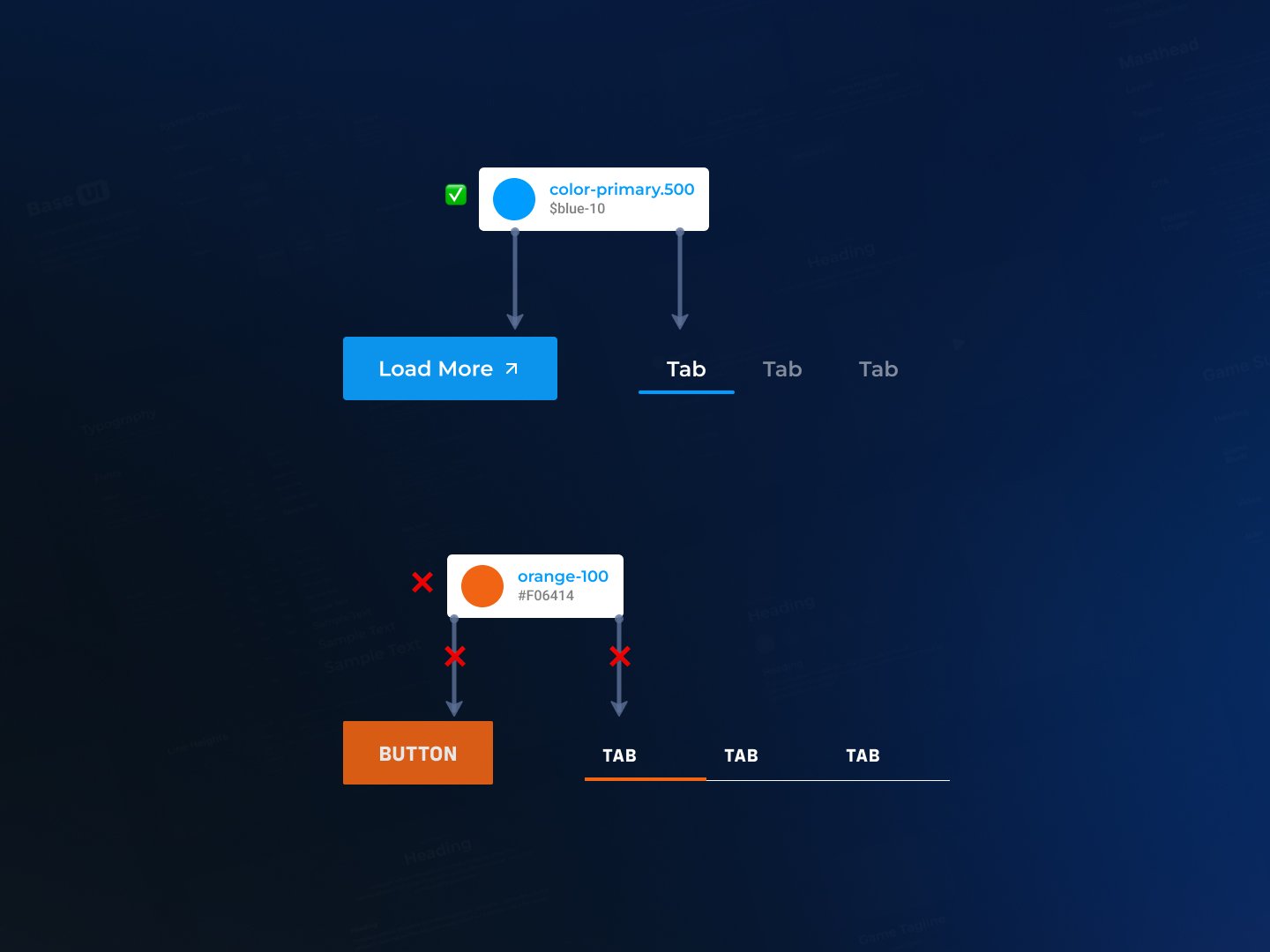
Existing consumers were overriding or bypassing existing tokens which created inconsistent styling, and isolating teams from future updates and additions.
There was no documentation nor functional workflow to maintain and edit themes for non-engineers
Process
In order to fully understand the current system, its strength and limitations, as well as the nuances needed to support the Battle.net brand, I drafted and led the team through these milestones in order to deliver an informed Tokenization of Base UI.
#1
Create a project plan
#2
Audit & define success
#3
Develop and release
#4
Onboard and educate
Defining success criteria
After completing our audit on all dimensions or our existing system, understanding Battle.net brand nuances to handle, and other various pain points observed (ex maintenance and editing),
we’ve aligned on key priorities to address after completiong of this project.
#1
Rebalance our tokens through effective semantic and dimensions layers.
#2
Create a tokens Playbook for naming and usage.
#3
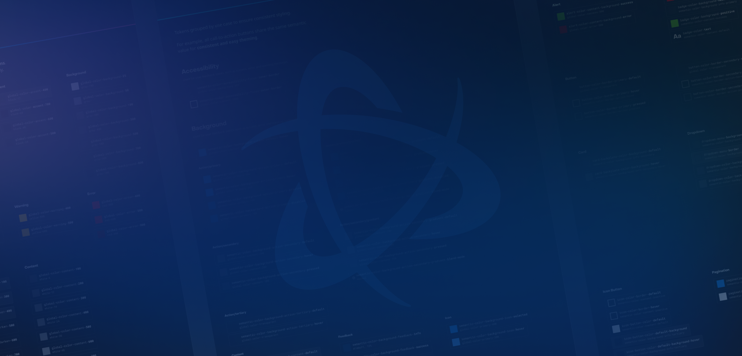
Document visually all tokens into a cross-discipline source of truth.
#4
Create a design to code pipeline and workflow to empower designers.
Tokens System
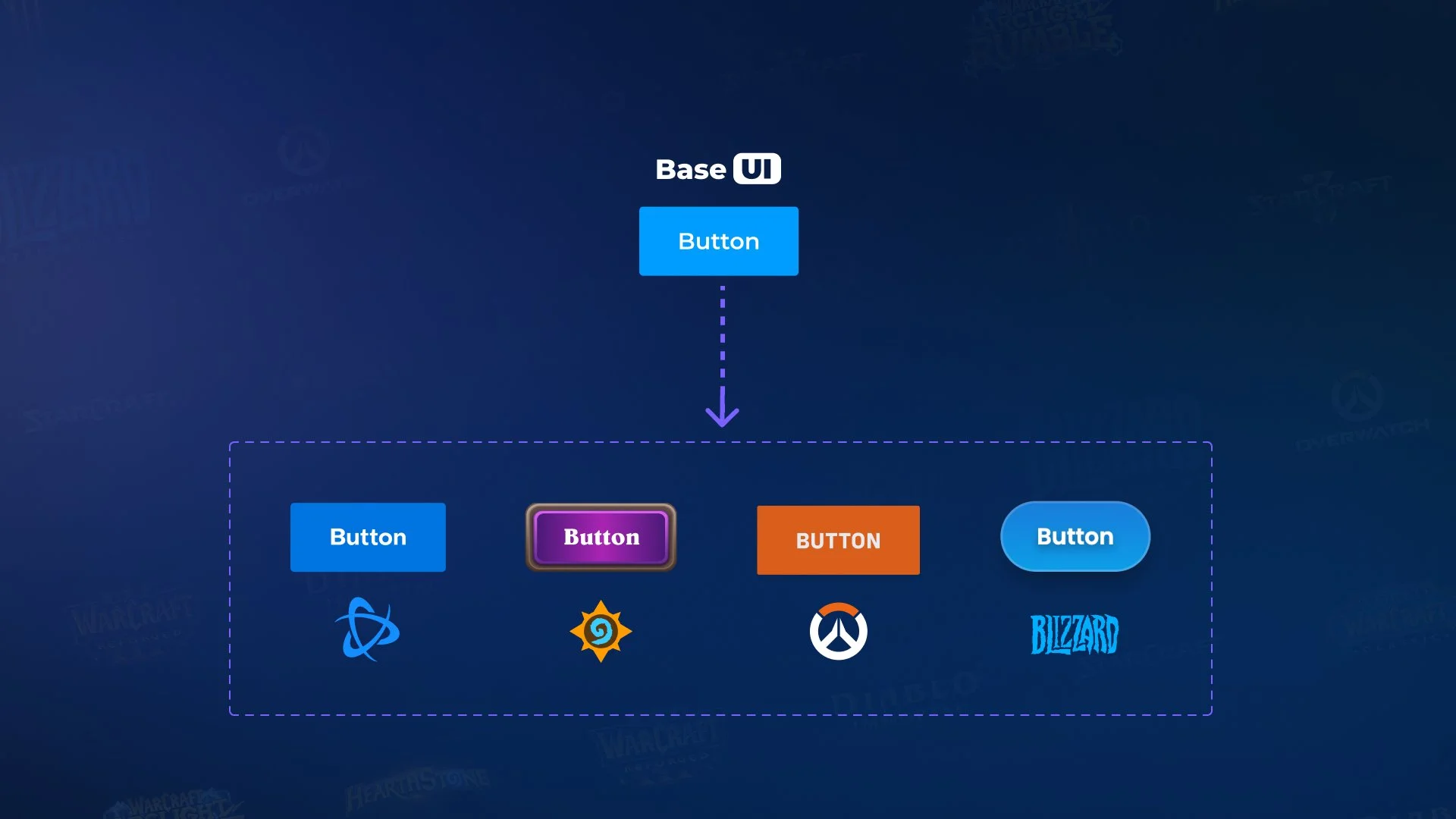
After rounds of iterations, making sure to include necessary nuances to allow multiple brand expressions (World of WarCraft, Blizzard, Battle.net, Overwatch, etc..), I’ve led and delivered a tokens architecture bundled as Base UI Themes.
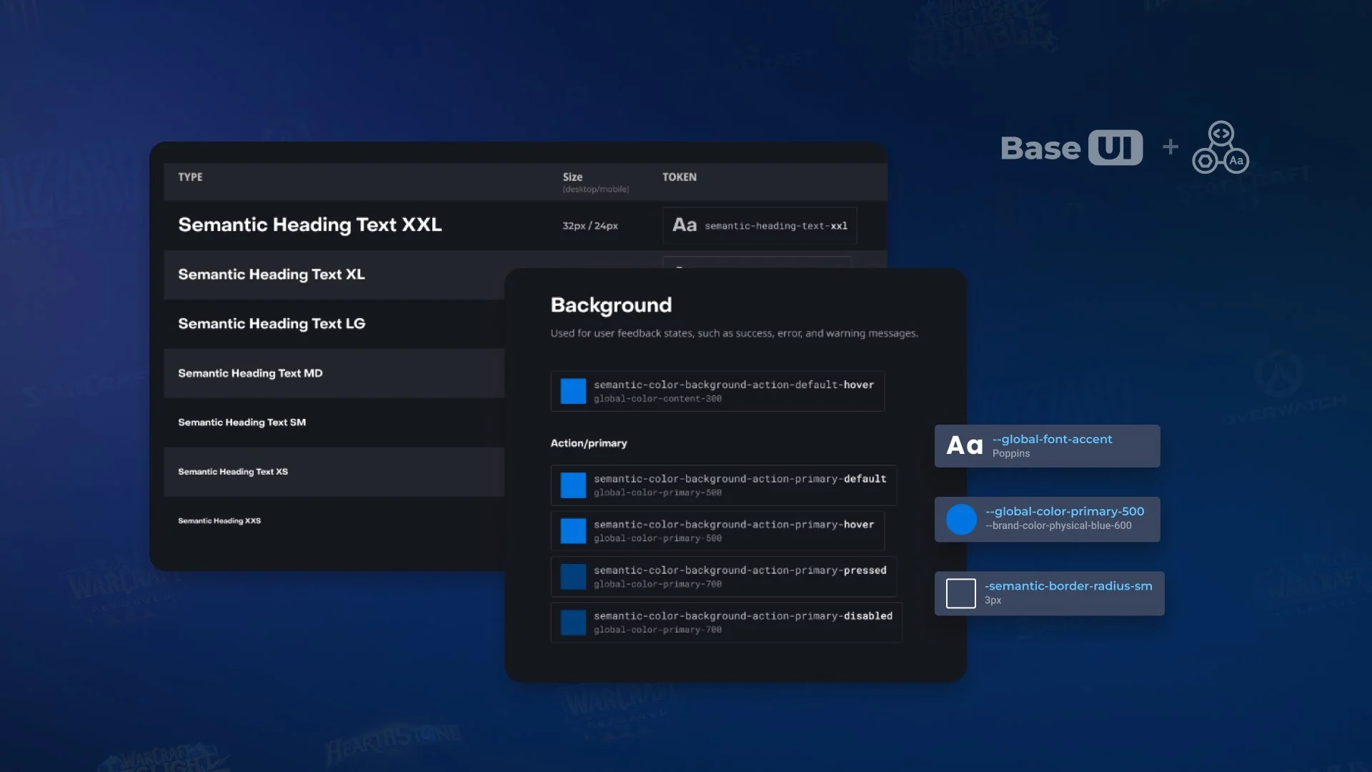
200+ tokens,
across 3 tiers
Global, Semantic, Component
4 tokens
dimensions
Typography, Color, Border, Shadow
40+ components
retrofitted
Figma and Code
3 themes &
2 densities
Battle.net/Blizzard, Compact/Comfy
Playbook
& Docs
To address inconsistent usage (internal/external) of tokens, as well as guiding designers on how to set up and use the new system, we’ve released various documentation.
Tokens Naming
Framework
in Storybook and Figma
Designer
Starter Kit
for designers self set up
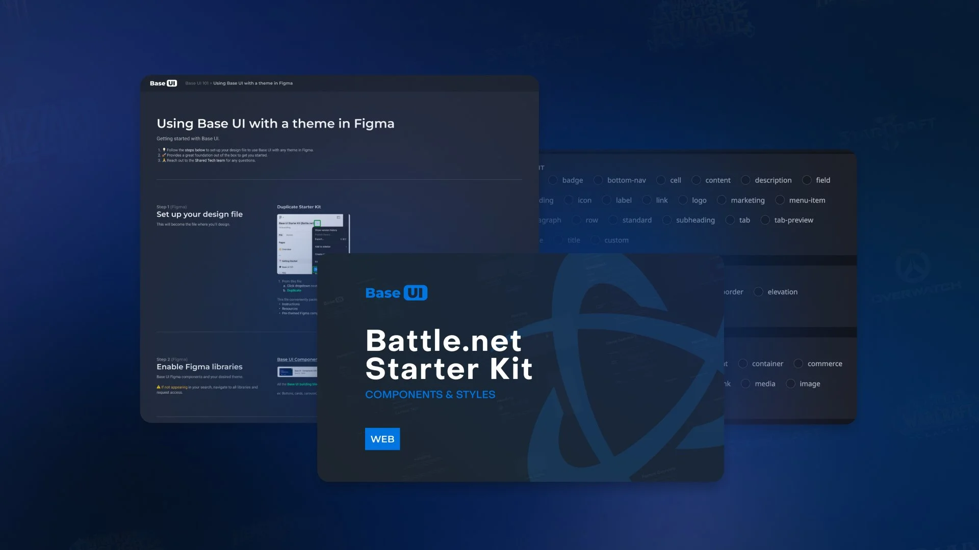
Design.code
pipeline
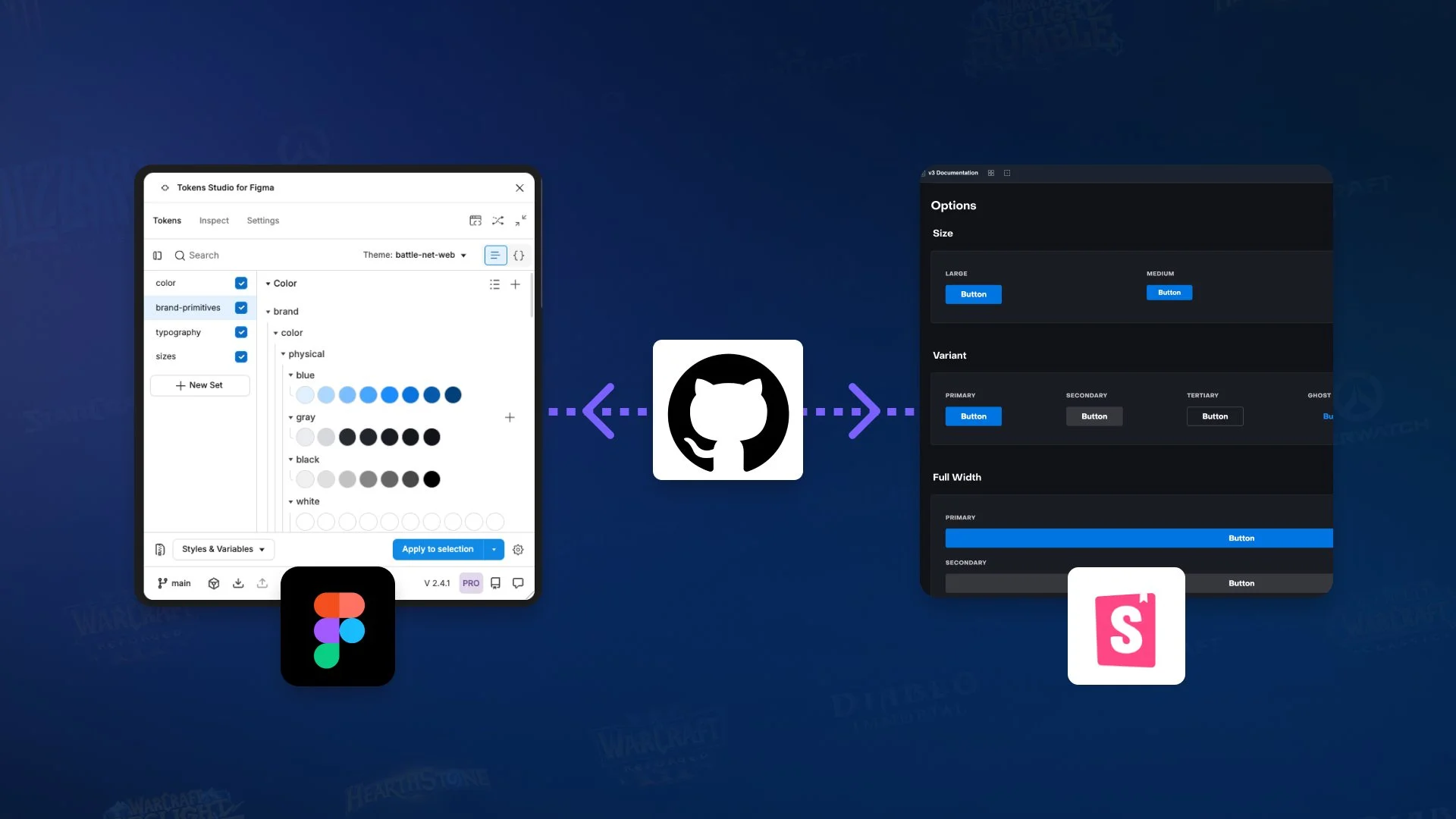
In order to give full autonomy for designers to maintain and create new themes, as well as saving engineering time from theming work, we’ve created a design to code pipeline giving control to any designer to edit and preview their themes.
Token Studio in Figma
to view and edit tokens
Themes
Code Previews
at the fingertips of non-engineers
Less reliance
on DS team
to expand branded experiences
Visualizing
Themes
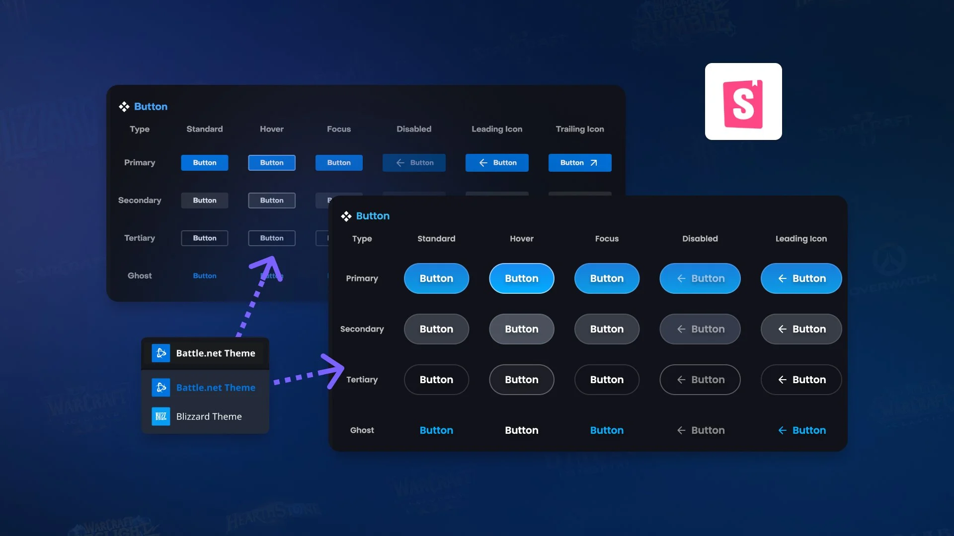
Lastly, we introduced a theme switcher for both designer (Figma) and developper experiences (Storybook), enabling teams to quickly visualize branded Base UI components and tokens, thus speeding up adoption and product development.
Theme Switcher
in Figma & Code
to quickly develop branded products
Shared visual
language
for design & dev partners
Impact
50% theming cost reduction
enabled by our improved tokens system and designer workflow
20% DS adoption increase
thanks to immediate applicability to Battle.net and Blizzard products
5 themes & density modes
for Battle.net, Blizzard, utilitarian or marketing contexts
Lessons learned
Going in a similar project to help product teams scale across more brands and touch points, with dev and design efficiency in mind,
I would do certain things differently or double down into some areas of the process.
-
Releasing a simple system with a potential for expansion will prove to be less expensive on the long run.
Initially putting out there a complex system necessitating constant revisions and trimming will be disruptive for consumers (dev & design), causing frustrations and trust errosion. -
Understanding brands needing scaled support and driving alignment across teams as part of the tokenization proces will siginificantly solidify the system, leading to faster adoption.
-
Brands inconsistencies and uniqueness may have occured out of lack of communication and no shared source of truth.
Always question these in an open and collaborative way in order to drive shared agreement across future adopters. -
Transforming a Design System style and tokens support are large projects with many interconnected parts.
While at it, make a big splash, find other improvements opportunity and value added for your users and brands. -
Don’t make assumptions or brand decisions influencing your tokens structure without consulting your end consumers and brand decision makers, even with your best intent.
Including them as early and frequently for feedback will build trust and increase the brand and UX quality of your products.