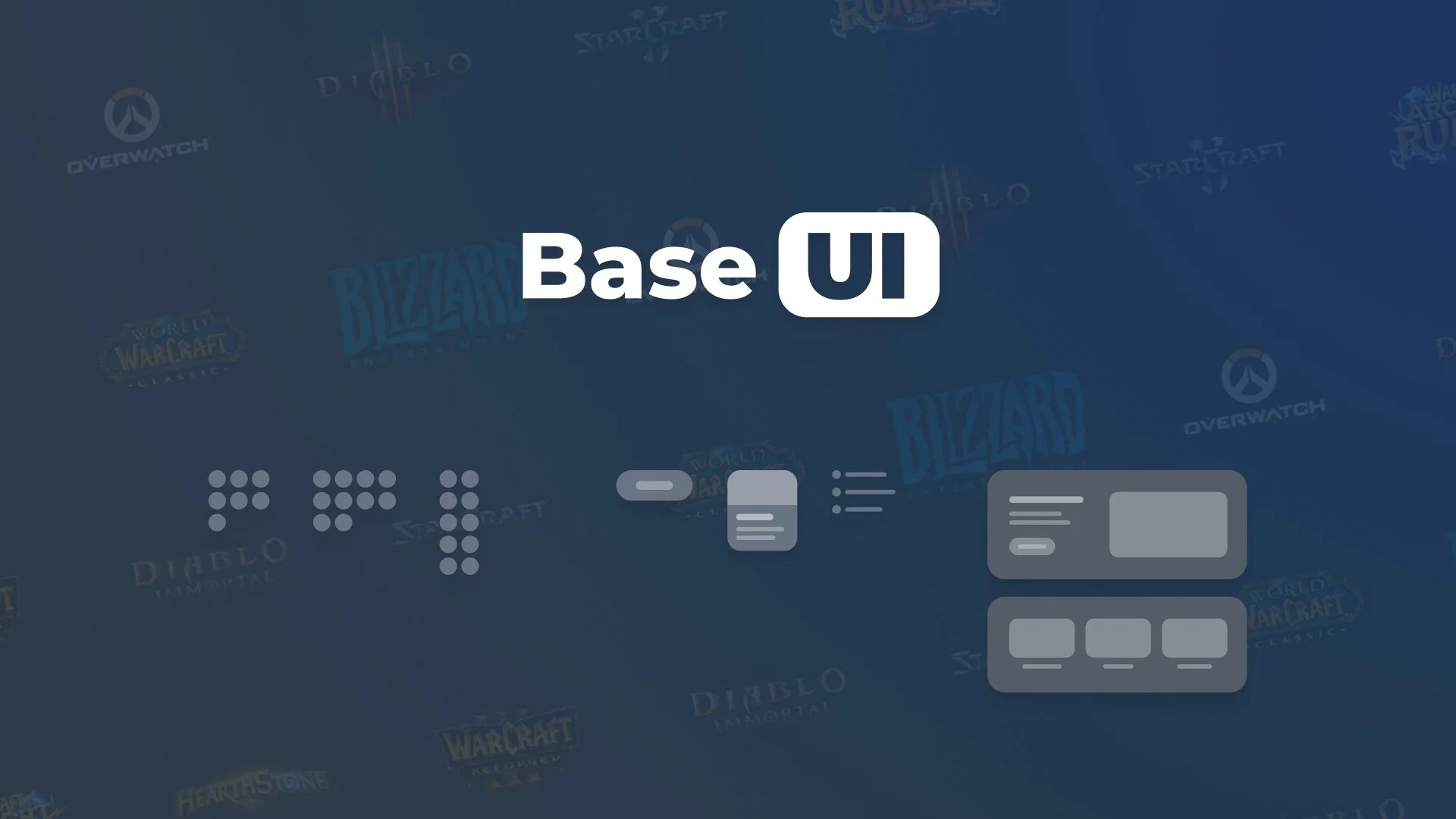
Blizzard Design System
Delivering games marketing pages at scale and with cohesion
Creating the Base UI design system and setting adoption strategies increased velocity for game teams to deliver cohesive and branded marketing pages to Blizzard players.
Overview
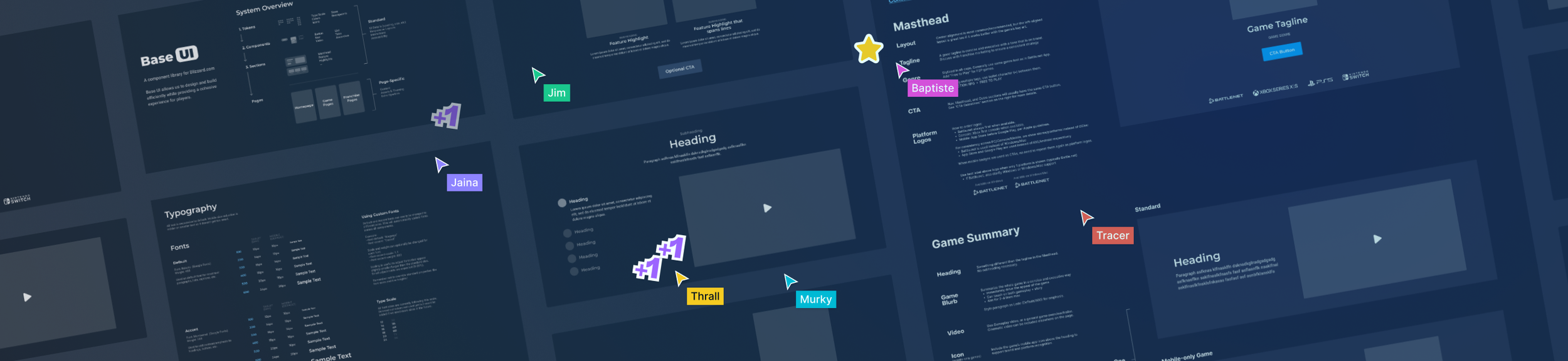
The Battle.net team at Blizzard created a dedicated group in 2020 composed of designers, engineers and product managers with a focus on creating a Design System powering all future game marketing pages. My main role was to expand our components (Figma/Web Components), guidelines and documentation as well as acting as a force-multiplier, in order to increase collaboration and evangelization efforts to enable development teams delivering acquisition-focused game pages, at scale and with UX cohesion.
ROLE
Senior Designer II
Co-leading design efforts: Strategy, execution, planning, collab, comms
Creating Design System components, documentations, and UX activities
Communicating progress, relevant updates, and presentations for evangelization and adoption of the system
Supporting 5 designers in consuming team, 4 software engineers for Design System development
EXPERTISE
Figma, Storybook, System Thinking, Leadership
PLATFORMS
Web & mobile
YEAR
2021 - 2022
Problem
Pre-2020, Battle.net had a variety of individual teams in charge of developing Game Sites.
Each game (5) had a one cross-functional team of 10+ individuals in charge of developping their own game marketing site
This allowed individual teams to deliver exceptionally custom and delightful experiences for end users with great visuals, immersive features and interactions, as well as a great level of information-depth (Leaderboards, Lore, etc..), every single part of the development process as well as bits and pieces composing these experiences were essentially duplicated.
The wheel was constantly re-invented, in silo between all games and all teams. This resulted in extremely fragmented user experiences within the Blizzard ecosystem and at an extremely high operational cost.

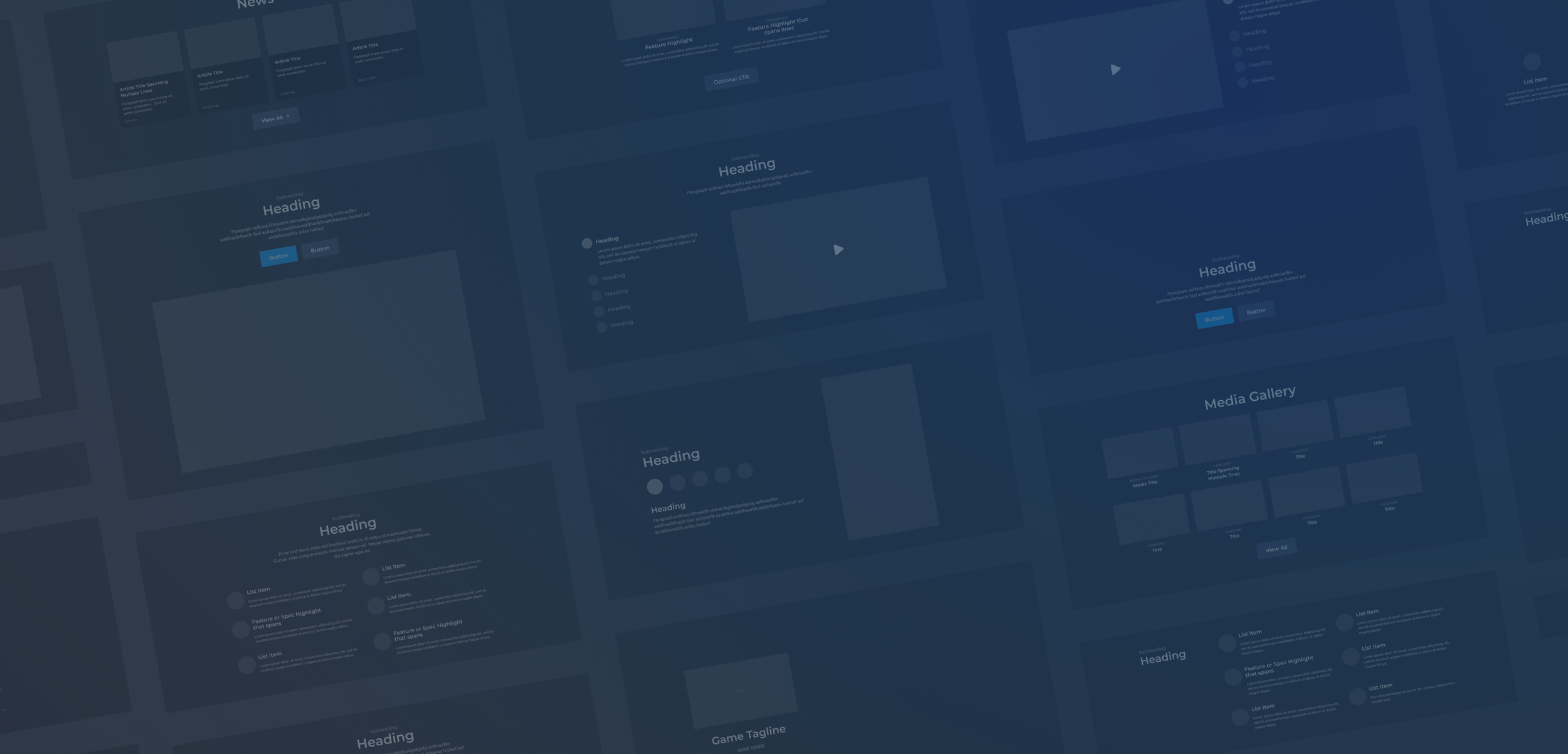
Design System
Like most industry Design Systems and experts, this was largely inspired by Brad Frost’s Atomic Design principles.
Each tier feeds the next and higher level, carrying design decisions and validated patterns, ensuring continuity of experience and UX cohesion.
Teams can use 🎨 Figma libraries as well as the live version of our components and sections visible in ⚙️ Storybook.
Tokens
Defines the most basic elements, but with extremely high re-usability throughout the system: colors, sizes, typography, drop-shadows, motion, etc..
Components
Interpretes tokens into medium-sized opinionated components: Buttons, Cards, Lists, Headers, Tabs, etc…
Sections
The 3rd tier of Base UI. Sections represent large chunks of a Page, focusing on an Action we want to expose to final users, or a Game feature: Masthead, Carousel, Value-props, Outros, etc…
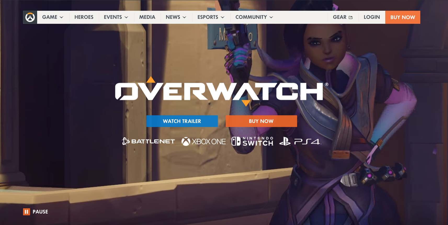
Powered by Base UI (sample)
-
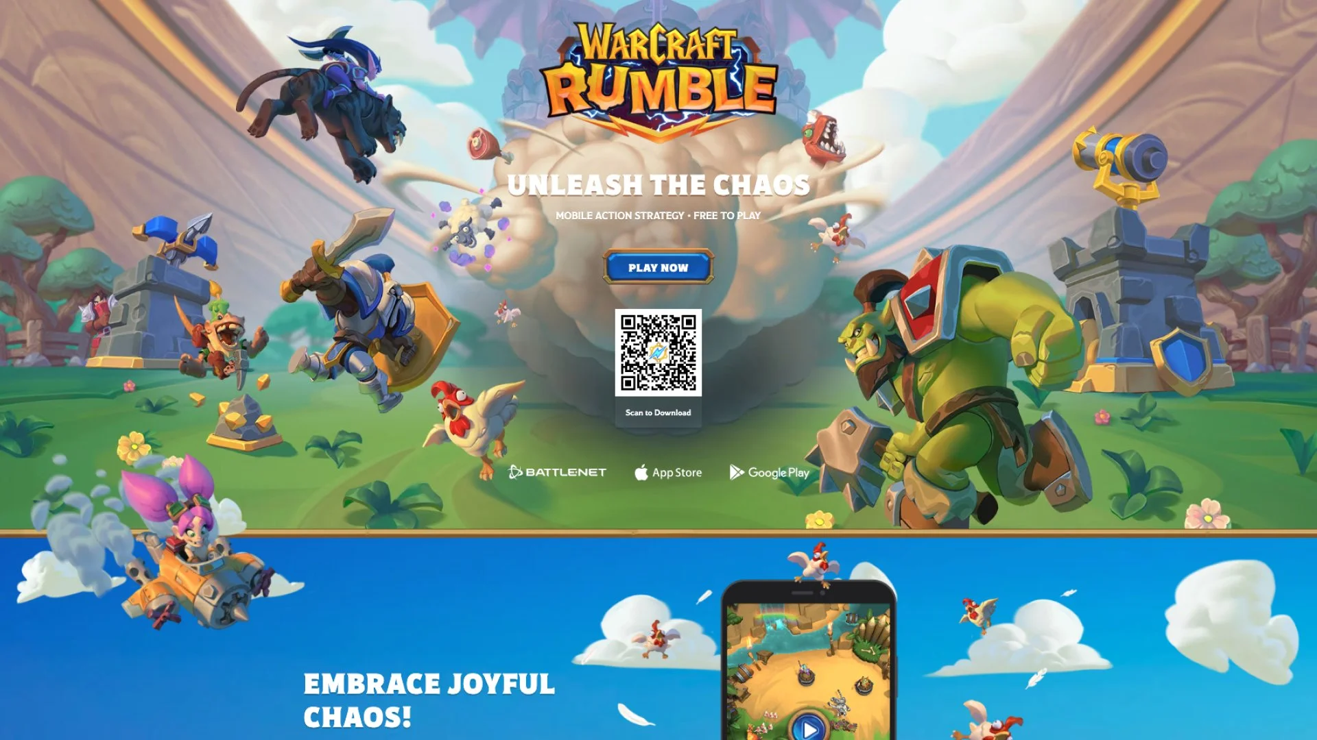
![WarCraft: Arclight Rumble]()
WarCraft: Arclight Rumble
-
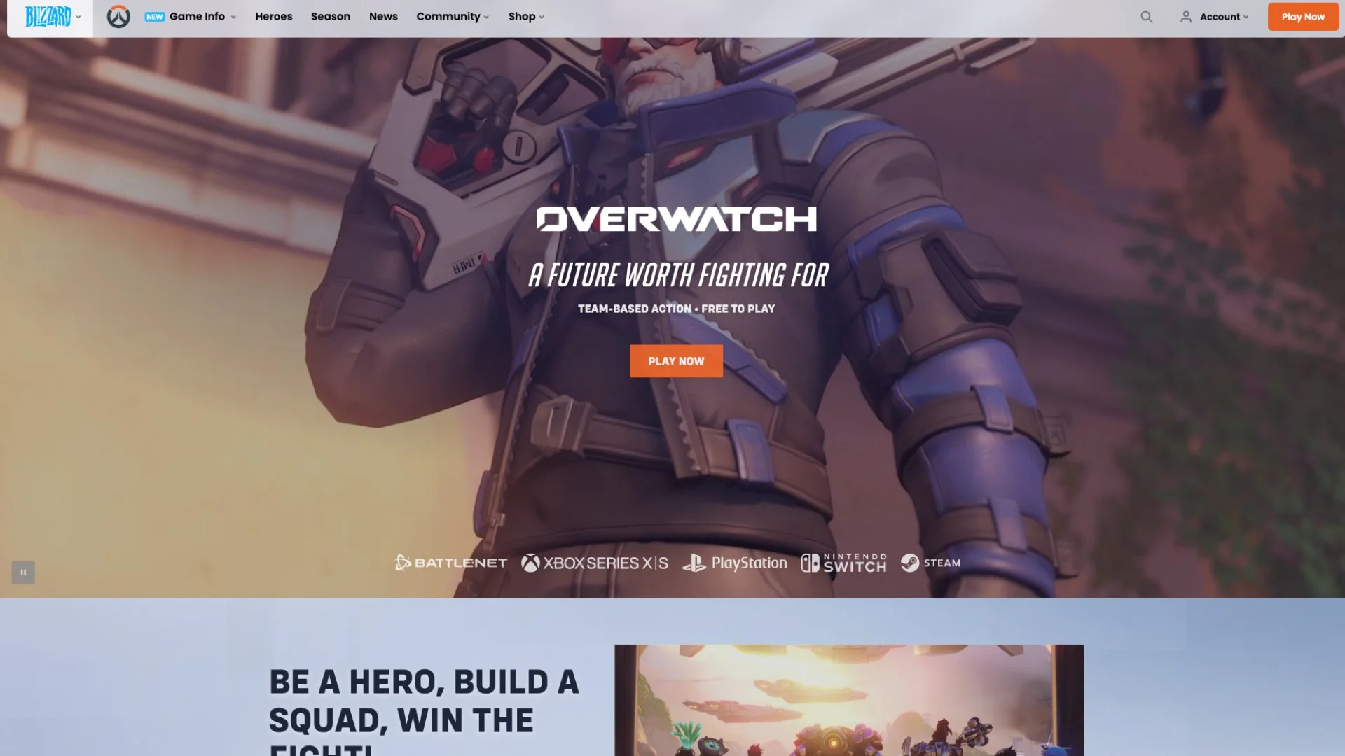
![Overwatch 2]()
Overwatch 2
-
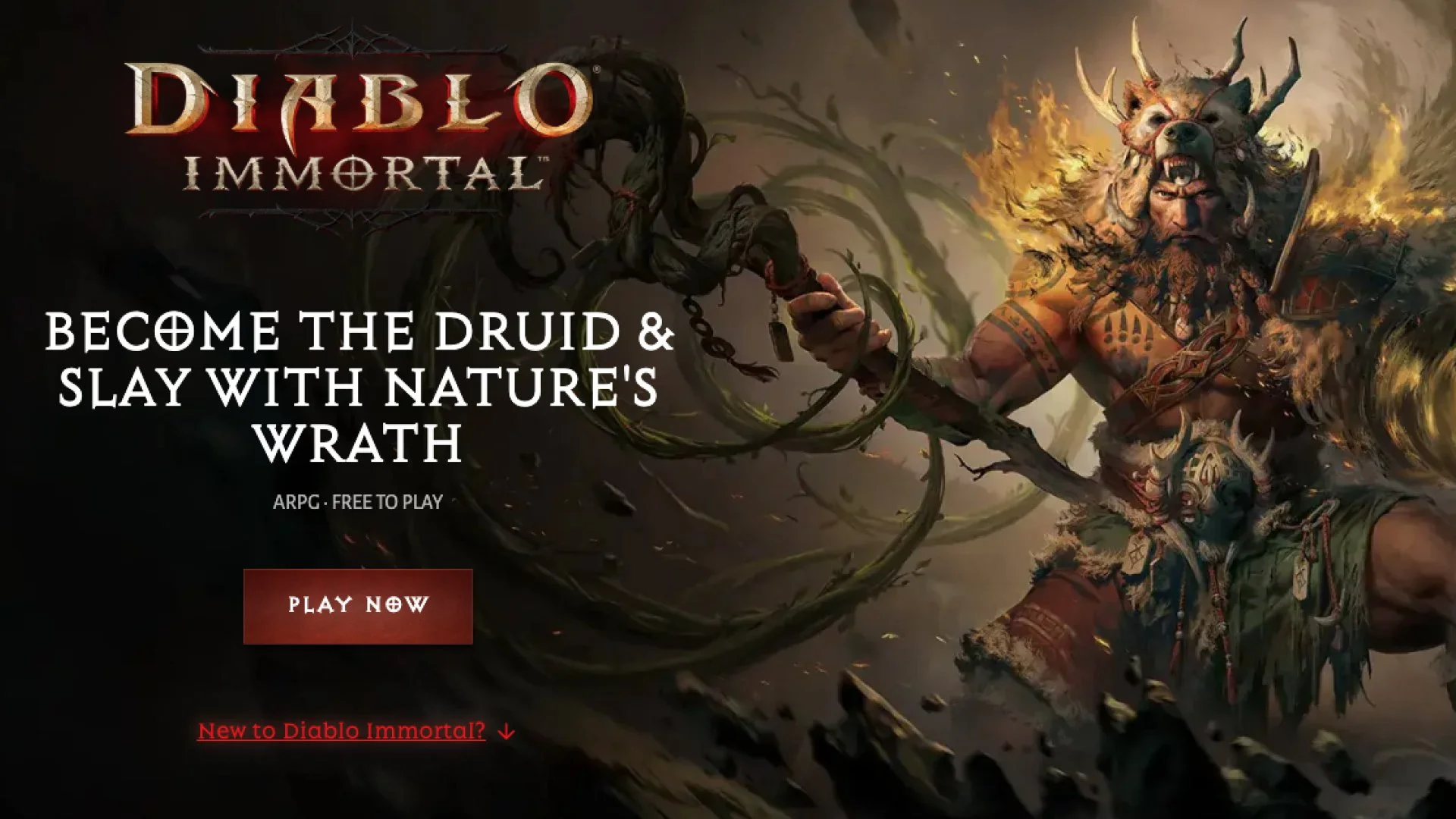
![]()
Diablo Immortal
-
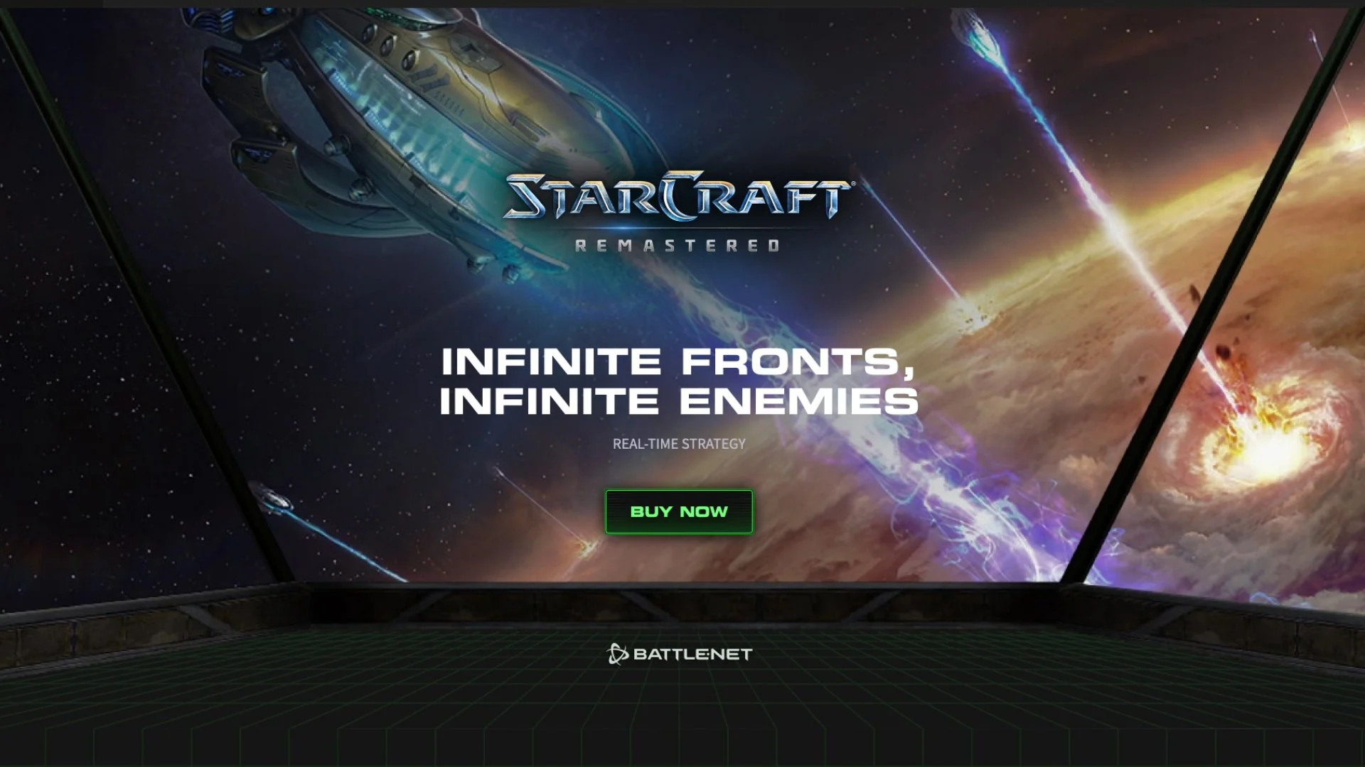
![StarCraft Remastered]()
StarCraft Remastered
Impact
80% dev time savings
per released website to players
10+ websites released
within first adoption year
30+ design & code
components
available for development teams to deliver games pages to players
Detailed case-study available on request.